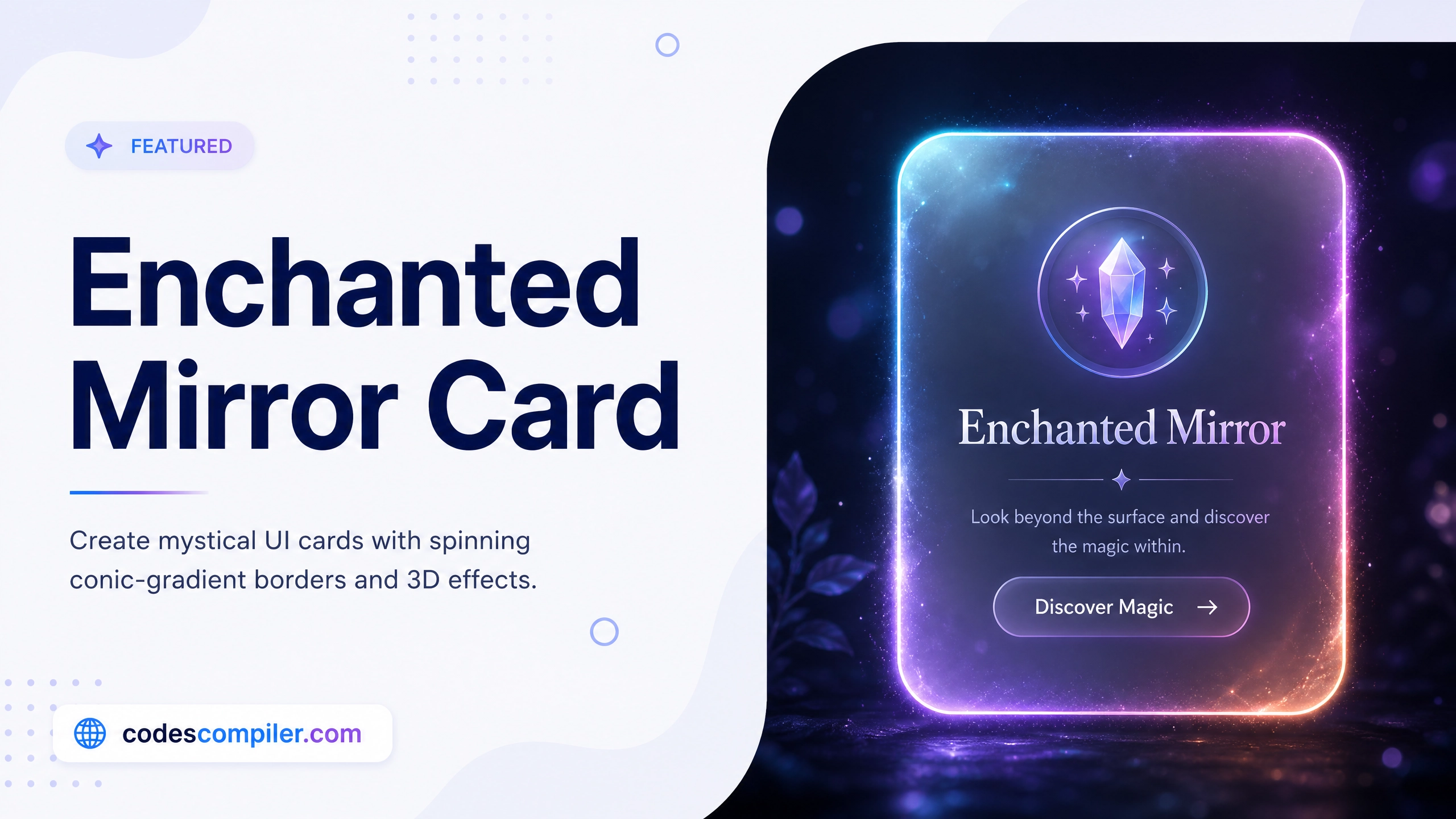
CSS Enchanted Mirror Card Effect Tutorial
Learn how to build a mystical, glassmorphism UI card featuring a spinning conic-gradient border and 3D hover effects.
Table of Contents
Welcome to this tutorial on building an Enchanted Mirror Card. Web design doesn’t have to be boring flat rectangles. With advanced CSS properties, we can create UI elements that look like mystical artifacts from a video game.
In this guide, we will combine Glassmorphism, a rotating Conic Gradient border, and 3D Transforms to create a stunning hover effect.
1. The Glassmorphism Base
First, we create the frosted glass effect. This is achieved using a highly transparent background combined with backdrop-filter: blur().
.card {
  position: relative;
  width: 320px;
  height: 480px;
  border-radius: 20px;

  /* Frosted Glass Effect */
  background: rgba(255, 255, 255, 0.05);
  backdrop-filter: blur(15px);

  /* Inner and outer glow */
  border: 1px solid rgba(255, 255, 255, 0.2);
  box-shadow: 0 30px 50px rgba(0,0,0,0.5), inset 0 0 20px rgba(255,255,255,0.1);

  overflow: hidden; /* Important for the border effect! */
}
2. The Spinning Conic Gradient Border
This is the coolest part of the effect. Instead of a standard CSS border, we use the ::before pseudo-element to create a massive spinning colorful disc behind the card contents.
Then, we use the ::after pseudo-element to stamp a dark rectangle right in the middle, leaving just the edges of the spinning disc visible!
/* 1. The massive spinning disc */
.card::before {
  content: '';
  position: absolute;
  top: -50%; left: -50%;
  width: 200%; height: 200%;

  /* The colors */
  background: conic-gradient(transparent, transparent, transparent, #8b5cf6, #d946ef, transparent);
  animation: rotate 4s linear infinite;
  z-index: -1;
}

/* 2. The dark solid center to hide the middle of the disc */
.card::after {
  content: '';
  position: absolute;
  inset: 3px; /* Leave a 3px gap at the edges! */
  background: #0f172a;
  border-radius: 17px;
  z-index: -1;
}

@keyframes rotate {
  100% { transform: rotate(360deg); }
}
3. The 3D Hover Transform
To give the card a sense of physical weight, we add a 3D rotation when the user hovers over the container.
We apply perspective to the body, and transform-style: preserve-3d to the container to enable 3D rendering.
.card-container {
  transition: transform 0.5s cubic-bezier(0.25, 1, 0.5, 1);
  transform-style: preserve-3d;
}

.card-container:hover {
  /* Lift up, tilt back, and twist slightly */
  transform: translateY(-10px) rotateX(10deg) rotateY(-5deg);
}
4. The Glare Effect
For the finishing touch, we add a diagonal white streak that flashes across the card on hover, simulating a light glare.
.glare {
  position: absolute;
  top: 0; left: -100%;
  width: 50%; height: 100%;
  background: linear-gradient(to right, rgba(255,255,255,0), rgba(255,255,255,0.3), rgba(255,255,255,0));
  transform: skewX(-20deg);
  transition: 0.5s;
}

/* Flash the glare across the screen */
.card-container:hover .glare {
  left: 150%;
}
Check out the Live Demo to see the mesmerising spinning border and 3D hover effects in action!