CSS Floating Lanterns Animation Tutorial
Learn how to build a beautiful CSS floating lanterns animation using keyframes and a touch of JavaScript.
Table of Contents
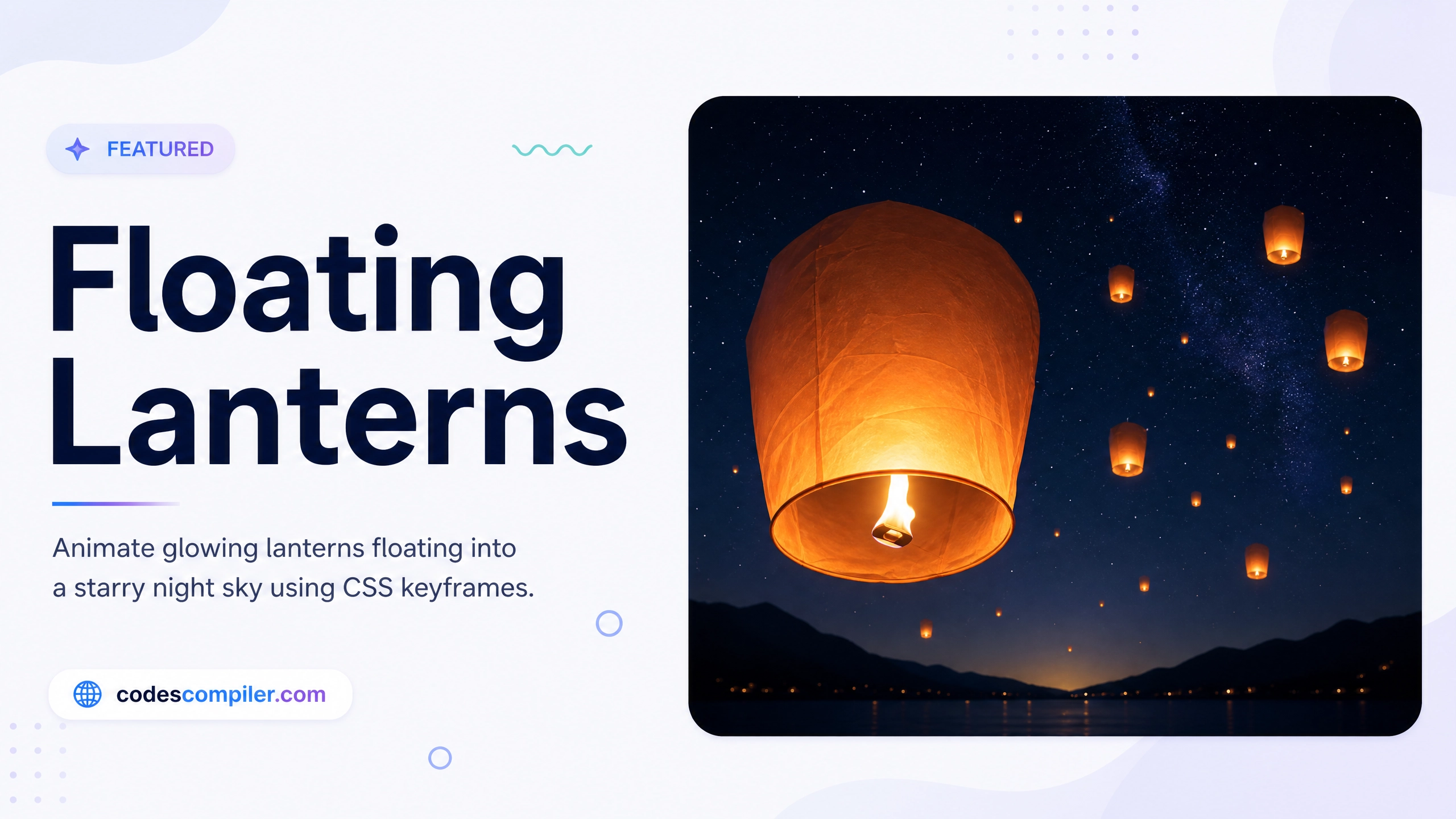
Welcome to this tutorial on creating a CSS Floating Lanterns animation. In this guide, we’ll build an interactive demo where you can type a wish and release a glowing lantern into the starry night sky.
This effect relies heavily on CSS gradients for the lantern’s glow and CSS keyframes for the smooth floating motion.
1. The Lantern CSS
First, we design the lantern. We use a linear gradient to give it a fiery paper texture, and use CSS filter: blur() and box-shadow on a pseudo-element to create the bright flame at the bottom.
.lantern {
  position: absolute;
  width: 40px;
  height: 60px;
  background: linear-gradient(#fde047, #ea580c);
  border-radius: 5px 5px 15px 15px;
  display: flex;
  align-items: center;
  justify-content: center;
  overflow: hidden;
  pointer-events: none;
}

/* The flame inside */
.lantern::after {
  content: '';
  position: absolute;
  bottom: 0;
  width: 10px;
  height: 10px;
  background: #fff;
  border-radius: 50%;
  filter: blur(4px);
  box-shadow: 0 0 20px #fff;
}
2. The Floating Animation
We want the lantern to float upwards from the bottom of the screen while gently swaying side-to-side.
@keyframes float {
  0% {
    transform: translateY(110vh) scale(0.8);
    opacity: 1;
    margin-left: 0;
  }
  30% {
    margin-left: 30px;
    opacity: 1;
  }
  70% {
    margin-left: -30px;
  }
  100% {
    /* Floats off the top of the screen and shrinks into the distance */
    transform: translateY(-30vh) scale(0.3);
    opacity: 0;
    margin-left: 0;
  }
}
3. The JavaScript Spawner
Finally, we use a touch of JavaScript to spawn a new lantern element every time the user clicks the “Release” button. We randomize its starting X position and animation duration so they don’t all look identical.
function release() {
  const text = document.getElementById('wishText').value;
  if(!text) return; // Don't release if empty

  // Clear the input
  document.getElementById('wishText').value = '';

  // Create lantern
  const lant = document.createElement('div');
  lant.className = 'lantern';

  // Randomize start position and speed
  lant.style.left = (Math.random() * 80 + 10) + 'vw';
  lant.style.animation = `float ${Math.random()*5 + 10}s ease-in forwards`;

  // Add an intense glowing drop shadow
  lant.style.boxShadow = '0 0 30px rgba(234, 88, 12, 0.8), 0 0 60px rgba(253, 224, 71, 0.6)';

  // Add to DOM
  document.body.appendChild(lant);

  // Clean up element after animation finishes
  setTimeout(() => lant.remove(), 15000);
}
By combining pure CSS animations with basic DOM manipulation, you can create a highly engaging, interactive background effect. Check out the Live Demo to release a wish yourself!