CSS Grid Blog Layout - Complete Step-by-Step Tutorial
Learn how to build a clean, responsive blog layout with featured images and a masonry-style grid layout using CSS Grid.
Table of Contents
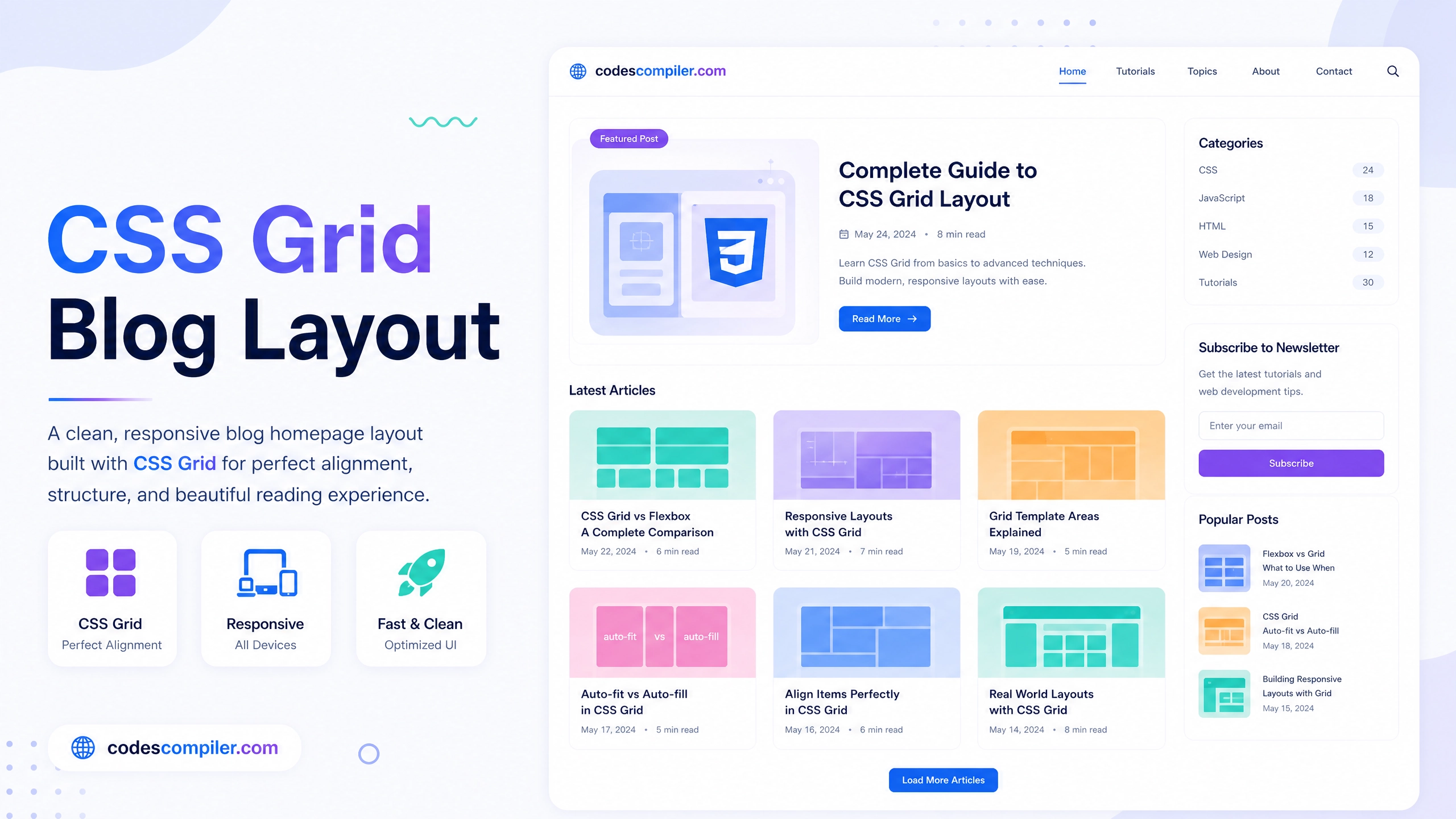
CSS Grid completely revolutionizes page layouts. Instead of messy floats or complex Flexbox math, Grid lets you define exact rows and columns. We’ll build a standard blog card layout.
The Grid Container
.blog-grid {
  display: grid;
  grid-template-columns: repeat(auto-fill, minmax(280px, 1fr));
  gap: 30px;
  list-style: none;
}
That one line: grid-template-columns: repeat(auto-fill, minmax(280px, 1fr)); creates a fully responsive layout that wraps automatically.
The Blog Card
.blog-card {
  background: #fff;
  border-radius: 12px;
  overflow: hidden;
  box-shadow: 0 4px 20px rgba(0,0,0,0.05);
  transition: transform 0.3s;
}

.blog-card:hover {
  transform: translateY(-5px);
}

.blog-img {
  width: 100%;
  height: 200px;
  object-fit: cover;
}

.blog-content {
  padding: 20px;
}
View the Live Demo to see the full responsiveness.