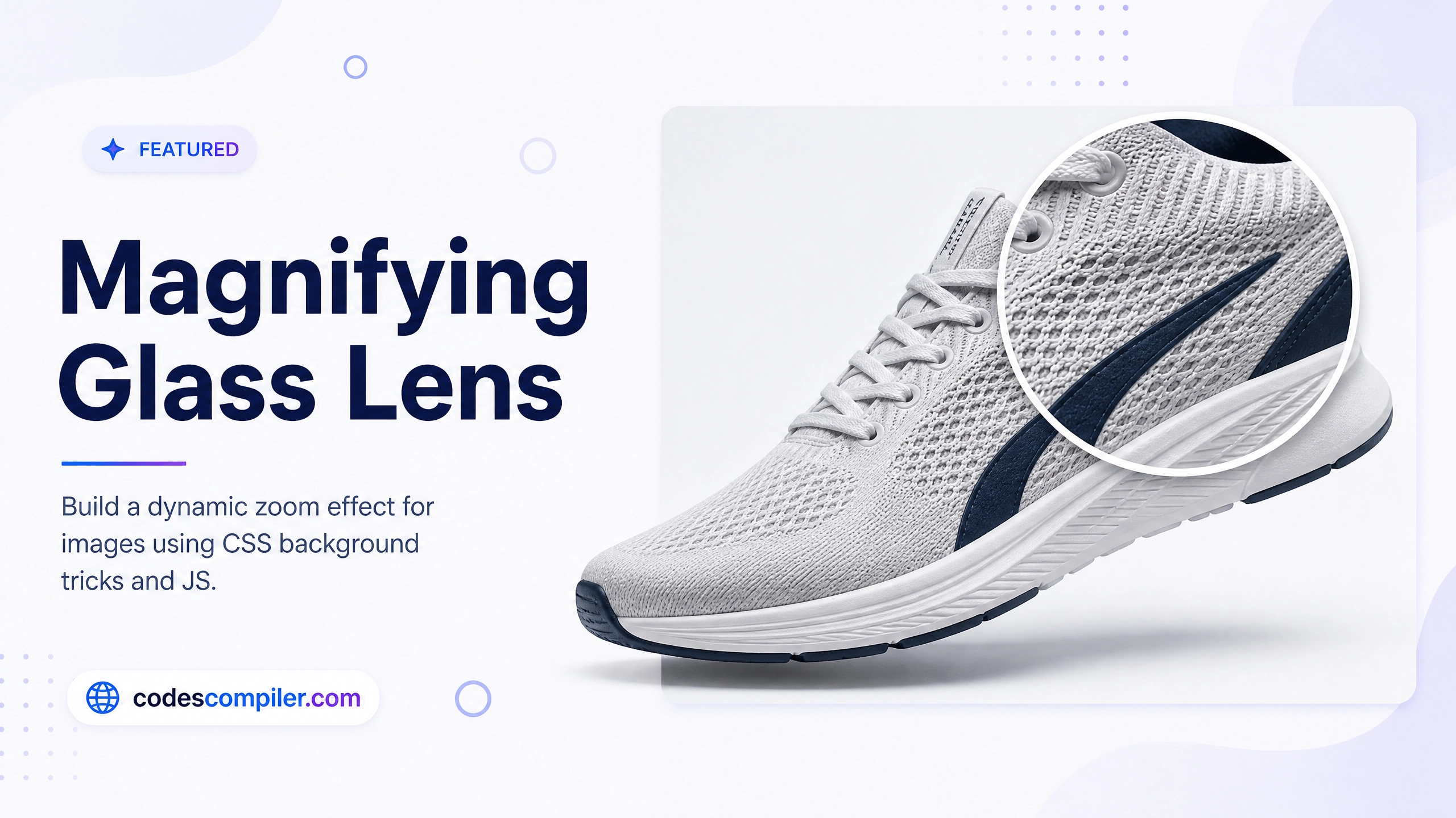
CSS Magnifying Glass Lens Effect Tutorial
Learn how to build a dynamic magnifying glass effect over images using CSS background properties and a touch of Vanilla JavaScript.
Table of Contents
Welcome to this tutorial on building a Magnifying Glass Lens Effect. This effect is extremely popular on eCommerce websites, allowing users to hover over a product image and inspect the fine details up close without opening a massive high-res image modal.
In this guide, we will achieve this effect using a clever CSS background trick combined with a few lines of Vanilla JavaScript to track the mouse.
1. The HTML Structure
Our structure is very simple. We need an image container, the main image itself, and a div that will act as our “Lens”.
<div class="image-container" id="container">
  <!-- The main visible image -->
  <img src="sneaker.jpg" class="main-image" id="mainImage" alt="Sneaker">

  <!-- The magnifying lens (initially hidden) -->
  <div class="lens" id="lens"></div>
</div>
2. The CSS Magic
Here is the trick: The .lens is a circle that floats above the image. Its background-image is set to the exact same image as the main image. We just scale that background image up, and shift its position to match where the mouse is pointing!
.image-container {
  position: relative;
  cursor: none; /* Hide the default mouse cursor! */
}

.lens {
  position: absolute;
  width: 150px;
  height: 150px;
  border-radius: 50%;
  border: 3px solid white;
  box-shadow: 0 10px 20px rgba(0,0,0,0.3);

  /* The Magic Trick: Same image as the main tag */
  background-image: url('sneaker.jpg');
  background-repeat: no-repeat;

  /* Hide until hover */
  opacity: 0;
  pointer-events: none; /* Let mouse events pass through to the container */
}

.image-container:hover .lens {
  opacity: 1; /* Show the lens when hovering over container */
}
3. The JavaScript Tracker
Now we need JavaScript to do three things when the mouse moves:
- Move the
.lenscircle to follow the cursor. - Calculate how big the background image inside the lens should be (the zoom level).
- Shift the background image position in the opposite direction of the mouse.
const container = document.getElementById('container');
const lens = document.getElementById('lens');
const mainImage = document.getElementById('mainImage');

// 2x Zoom level
const zoomLevel = 2;

container.addEventListener('mousemove', (e) => {
  // 1. Get exact cursor coordinates relative to the container
  const rect = container.getBoundingClientRect();
  const x = e.clientX - rect.left;
  const y = e.clientY - rect.top;

  // 2. Center the lens on the cursor
  const lensRadius = lens.offsetWidth / 2;
  lens.style.left = `${x - lensRadius}px`;
  lens.style.top = `${y - lensRadius}px`;

  // 3. Set background size (Zoom the image)
  const bgWidth = mainImage.width * zoomLevel;
  const bgHeight = mainImage.height * zoomLevel;
  lens.style.backgroundSize = `${bgWidth}px ${bgHeight}px`;

  // 4. Shift the background image position
  const bgPosX = (x * zoomLevel) - lensRadius;
  const bgPosY = (y * zoomLevel) - lensRadius;
  lens.style.backgroundPosition = `-${bgPosX}px -${bgPosY}px`;
});
And there you have it! A perfectly smooth, highly performant magnifying glass effect. Check out the Live Demo to see the code in action.