Build an Interactive Lamp Login Form using HTML, CSS & JS
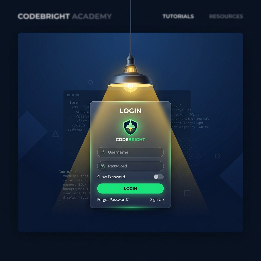
Design a stunning interactive login page with a swinging ceiling lamp that responds to cursor movements and casts a spotlight beam that focuses directly on active input fields.
Table of Contents
A creative and interactive login page can turn a standard, boring form into a memorable user experience. In this tutorial, we will build a premium, interactive lamp login form using vanilla HTML, CSS, and JavaScript.
Here are the key features we will implement:
- Ceiling-Hanging Lamp: A minimalist lamp that hangs from the top center of the page.
- Interactive Pull Cord: Clicking the pull cord triggers an elastic snap-back animation and toggles the light ON or OFF.
- Spotlight Light Beam: When the light is ON, a glowing, warm-yellow spotlight beam illuminates the glassmorphic login card.
- Dynamic Mouse-Tracking: Moving the mouse over the page causes the lamp to swing and tilt slightly towards the cursor.
- Spotlight Input Focus: Focusing on the Email or Password field makes the lamp sweep over and shine its spotlight directly onto the focused input field.
- Glassmorphic Login Card: A beautiful, translucent dark-mode card structure with smooth transitions and floating labels.
Interactive Pull Cord Animation
The pull cord is designed with a separate container containing a thread line and a handle bulb. Clicking it triggers a quick height increase and releases it with an elastic swing effect:
/* Pull animation via class addition */
.pull-cord.pulling .pull-cord-line {
  height: 215px; /* extends when clicked */
}

/* Keyframe for physics-based back-and-forth swing after release */
@keyframes cordSwing {
  0% { transform: rotate(0deg); }
  15% { transform: rotate(-18deg); }
  30% { transform: rotate(14deg); }
  45% { transform: rotate(-10deg); }
  60% { transform: rotate(6deg); }
  75% { transform: rotate(-3deg); }
  100% { transform: rotate(0deg); }
}

.pull-cord.swing {
  animation: cordSwing 1.6s cubic-bezier(0.36, 0.07, 0.19, 0.97) both;
}
Moving the Spotlight Beam
To make the spotlight swing, we nest the light beam inside the .lamp-assembly container. By setting the pivot point at the top center (transform-origin: top center), any Z-axis rotation we apply to the parent container will automatically tilt the entire assembly (mount, cord, bulb, and spotlight) in unison!
.lamp-assembly {
  position: absolute;
  top: 0;
  left: 50%;
  transform: translateX(-50%);
  transform-origin: top center;
  transition: transform 0.6s cubic-bezier(0.25, 1, 0.5, 1);
}

.light-beam {
  position: absolute;
  top: 38px;
  left: 50%;
  transform: translateX(-50%);
  width: 800px;
  height: 900px;
  background: linear-gradient(to bottom,
                rgba(253, 224, 71, 0.22) 0%,
                rgba(253, 224, 71, 0.06) 45%,
                rgba(253, 224, 71, 0) 100%);
  clip-path: polygon(50% 0%, 0% 100%, 100% 100%);
  pointer-events: none;
  transform-origin: top center;
}
JavaScript Math for Mouse Tracking
To compute the tilt angle when tracking the mouse pointer, we find the coordinate difference between the cursor and the lamp pivot point. We can then apply a standard trigonometric arctangent (Math.atan2) to find the angle, convert it to degrees, clamp it to prevent excessive swing, and apply it:
document.addEventListener('mousemove', (e) => {
  // Get boundary rect of the lamp to find its center
  const lampRect = lampAssembly.getBoundingClientRect();
  const lampX = lampRect.left + (lampRect.width / 2);
  const lampY = lampRect.top;

  const deltaX = e.clientX - lampX;
  const deltaY = e.clientY - lampY;

  // Calculate angle and convert to degrees
  let angle = Math.atan2(deltaX, deltaY) * (180 / Math.PI);
  angle = -angle; // Invert Z-axis direction

  // Clamp angle to a maximum swing of 22 degrees
  const maxAngle = 22;
  const clampedAngle = Math.max(-maxAngle, Math.min(maxAngle, angle));

  // Rotate assembly
  lampAssembly.style.transform = `translateX(-50%) rotate(${clampedAngle}deg)`;
});
Complete Project Code
Below is the complete standalone page including HTML, CSS styles, and interactive JavaScript logic:
<!DOCTYPE html>
<html lang="en">
<head>
  <meta charset="UTF-8">
  <meta name="viewport" content="width=device-width, initial-scale=1.0">
  <title>Interactive Lamp Login Form</title>
  <style>
    *, *::before, *::after { box-sizing: border-box; margin: 0; padding: 0; }

    body {
      min-height: 100vh;
      display: flex;
      align-items: center;
      justify-content: center;
      background: radial-gradient(circle at 50% 10%, #111827 0%, #030712 100%);
      font-family: 'Segoe UI', system-ui, -apple-system, sans-serif;
      padding: 20px;
      overflow: hidden;
      perspective: 1000px;
      transition: background 0.5s ease;
    }

    body.lamp-off {
      background: #02040a;
    }

    /* ── LAMP ASSEMBLY ───────────────────────────────────────── */
    .lamp-assembly {
      position: absolute;
      top: 0;
      left: 50%;
      transform: translateX(-50%);
      transform-origin: top center;
      display: flex;
      flex-direction: column;
      align-items: center;
      z-index: 10;
      pointer-events: none;
      transition: transform 0.6s cubic-bezier(0.25, 1, 0.5, 1);
    }

    .lamp-mount {
      width: 40px;
      height: 8px;
      background: #1f2937;
      border-radius: 0 0 6px 6px;
      box-shadow: 0 2px 4px rgba(0,0,0,0.5);
    }

    .lamp-cord {
      width: 3px;
      height: 110px;
      background: linear-gradient(to bottom, #374151, #1f2937);
    }

    .lamp-head {
      width: 70px;
      height: 40px;
      background: linear-gradient(135deg, #374151 0%, #111827 100%);
      border-radius: 35px 35px 0 0;
      position: relative;
      box-shadow: 0 4px 12px rgba(0, 0, 0, 0.4);
      display: flex;
      justify-content: center;
    }

    .lamp-rim {
      position: absolute;
      bottom: -2px;
      width: 74px;
      height: 4px;
      background: #4b5563;
      border-radius: 2px;
    }

    .lamp-bulb {
      width: 22px;
      height: 22px;
      background: #9ca3af;
      border-radius: 50%;
      position: absolute;
      bottom: -11px;
      box-shadow: inset 0 2px 4px rgba(255, 255, 255, 0.2);
      transition: background 0.3s ease, box-shadow 0.3s ease;
    }

    body:not(.lamp-off) .lamp-bulb {
      background: #fef08a;
      box-shadow: 0 0 25px 8px rgba(253, 224, 71, 0.8),
                  0 0 50px 15px rgba(253, 224, 71, 0.4),
                  inset 0 -2px 4px rgba(0,0,0,0.2);
    }

    /* ── LIGHT BEAM ──────────────────────────────────────────── */
    .light-beam {
      position: absolute;
      top: 38px;
      left: 50%;
      transform: translateX(-50%);
      width: 800px;
      height: 900px;
      background: linear-gradient(to bottom,
                    rgba(253, 224, 71, 0.22) 0%,
                    rgba(253, 224, 71, 0.06) 45%,
                    rgba(253, 224, 71, 0) 100%);
      clip-path: polygon(50% 0%, 0% 100%, 100% 100%);
      pointer-events: none;
      transform-origin: top center;
      opacity: 1;
      transition: opacity 0.5s cubic-bezier(0.4, 0, 0.2, 1);
    }

    body.lamp-off .light-beam {
      opacity: 0;
    }

    /* ── PULL CORD ───────────────────────────────────────────── */
    .pull-cord {
      position: absolute;
      top: 0;
      left: calc(50% + 50px);
      width: 24px;
      height: 220px;
      cursor: pointer;
      z-index: 12;
      transform-origin: top center;
      pointer-events: all;
    }

    .pull-cord-line {
      width: 2px;
      height: 190px;
      background: repeating-linear-gradient(
        to bottom,
        #4b5563,
        #4b5563 4px,
        #1f2937 4px,
        #1f2937 8px
      );
      margin: 0 auto;
      transition: height 0.15s cubic-bezier(0.175, 0.885, 0.32, 1.275);
    }

    .pull-cord-handle {
      width: 14px;
      height: 14px;
      background: linear-gradient(135deg, #9ca3af 0%, #4b5563 100%);
      border-radius: 50%;
      margin: 0 auto;
      border: 1px solid #374151;
      box-shadow: 0 3px 6px rgba(0,0,0,0.5);
    }

    .pull-cord.pulling .pull-cord-line {
      height: 215px;
    }

    @keyframes cordSwing {
      0% { transform: rotate(0deg); }
      15% { transform: rotate(-18deg); }
      30% { transform: rotate(14deg); }
      45% { transform: rotate(-10deg); }
      60% { transform: rotate(6deg); }
      75% { transform: rotate(-3deg); }
      100% { transform: rotate(0deg); }
    }

    .pull-cord.swing {
      animation: cordSwing 1.6s cubic-bezier(0.36, 0.07, 0.19, 0.97) both;
    }

    /* ── LOGIN CARD ──────────────────────────────────────────── */
    .login-container {
      position: relative;
      width: 100%;
      max-width: 400px;
      z-index: 8;
      transition: transform 0.6s cubic-bezier(0.25, 1, 0.5, 1);
    }

    .login-card {
      background: rgba(17, 24, 39, 0.2);
      border: 1px solid rgba(255, 255, 255, 0.08);
      border-radius: 28px;
      padding: 44px 40px;
      box-shadow:
        0 20px 50px rgba(0, 0, 0, 0.4),
        inset 0 1px 0 rgba(255, 255, 255, 0.05);
      backdrop-filter: blur(16px);
      -webkit-backdrop-filter: blur(16px);
      transition: background 0.5s ease, border-color 0.5s ease, box-shadow 0.5s ease;
      position: relative;
    }

    body:not(.lamp-off) .login-card {
      background: rgba(17, 24, 39, 0.55);
      border-color: rgba(253, 224, 71, 0.18);
      box-shadow:
        0 25px 60px rgba(0, 0, 0, 0.5),
        0 0 40px rgba(253, 224, 71, 0.04),
        inset 0 1px 0 rgba(255, 255, 255, 0.08);
    }

    .brand { display: flex; align-items: center; gap: 10px; margin-bottom: 28px; }
    .brand-icon {
      width: 42px; height: 42px; border-radius: 12px;
      background: linear-gradient(135deg, #04AA6D 0%, #027a4e 100%);
      display: flex; align-items: center; justify-content: center;
      font-size: 19px; font-weight: 900; color: #fff;
    }
    .brand-name { font-size: 19px; font-weight: 800; color: #fff; }
    .brand-name span { color: #04AA6D; }

    h2 { font-size: 24px; font-weight: 800; color: #f3f4f6; margin-bottom: 6px; }
    .sub-text { font-size: 14px; color: #9ca3af; margin-bottom: 32px; transition: color 0.5s; }
    body.lamp-off .sub-text { color: #4b5563; }

    /* ── FORM FIELDS & FLOATING LABELS ───────────────────────── */
    .input-group { position: relative; margin-bottom: 22px; }
    .input-group input {
      width: 100%;
      padding: 16px 18px;
      background: rgba(255, 255, 255, 0.02);
      border: 1px solid rgba(255, 255, 255, 0.08);
      border-radius: 14px;
      color: #f9fafb;
      font-size: 15px;
      outline: none;
      font-family: inherit;
      transition: border-color 0.3s, background-color 0.3s, box-shadow 0.3s;
    }

    body.lamp-off .input-group input:focus {
      border-color: #04AA6D;
      box-shadow: 0 0 15px rgba(4, 170, 109, 0.3);
    }

    body:not(.lamp-off) .input-group input:focus {
      border-color: #fde047;
      box-shadow: 0 0 0 3px rgba(253, 224, 71, 0.15);
    }

    .input-group label {
      position: absolute; left: 18px; top: 17px;
      color: #6b7280; font-size: 15px; pointer-events: none;
      transition: all 0.25s cubic-bezier(0.4, 0, 0.2, 1);
    }

    .input-group input:focus + label,
    .input-group input:not(:placeholder-shown) + label {
      top: -10px; font-size: 11px; font-weight: 700;
      background: #0d121f; padding: 0 8px; border-radius: 6px;
    }

    body.lamp-off .input-group input:focus + label,
    body.lamp-off .input-group input:not(:placeholder-shown) + label { color: #04AA6D; }
    body:not(.lamp-off) .input-group input:focus + label,
    body:not(.lamp-off) .input-group input:not(:placeholder-shown) + label { color: #fde047; }

    .password-toggle {
      position: absolute; right: 16px; top: 50%; transform: translateY(-50%);
      background: none; border: none; cursor: pointer; color: #6b7280;
    }

    .forgot-link { text-align: right; margin-top: -12px; margin-bottom: 24px; }
    .forgot-link a { font-size: 13px; color: #9ca3af; text-decoration: none; }
    .forgot-link a:hover { color: #04AA6D; }
    body:not(.lamp-off) .forgot-link a:hover { color: #fde047; }

    .submit-btn {
      width: 100%; padding: 16px; background: linear-gradient(135deg, #04AA6D 0%, #027a4e 100%);
      border: none; border-radius: 14px; color: #fff; font-size: 16px; font-weight: 700;
      cursor: pointer; font-family: inherit; box-shadow: 0 4px 18px rgba(4, 170, 109, 0.3);
      transition: transform 0.2s, box-shadow 0.2s;
    }

    .submit-btn:hover { transform: translateY(-2px); box-shadow: 0 8px 24px rgba(4, 170, 109, 0.4); }
    body:not(.lamp-off) .submit-btn {
      background: linear-gradient(135deg, #eab308 0%, #ca8a04 100%);
      box-shadow: 0 4px 18px rgba(234, 179, 8, 0.25);
    }
    body:not(.lamp-off) .submit-btn:hover { box-shadow: 0 8px 24px rgba(234, 179, 8, 0.35); }

    .divider { display: flex; align-items: center; gap: 12px; margin: 22px 0; }
    .divider::before, .divider::after { content: ''; flex: 1; height: 1px; background: rgba(255, 255, 255, 0.08); }
    .divider span { font-size: 12px; color: #4b5563; }

    .social-btn {
      width: 100%; padding: 14px; background: rgba(255, 255, 255, 0.03);
      border: 1px solid rgba(255, 255, 255, 0.08); border-radius: 14px; color: #e5e7eb;
      font-size: 14px; font-weight: 600; cursor: pointer; font-family: inherit;
      display: flex; align-items: center; justify-content: center; gap: 8px;
    }
    .social-btn:hover { background: rgba(255, 255, 255, 0.07); color: #fff; }

    .signup-link { text-align: center; margin-top: 24px; font-size: 14px; color: #6b7280; }
    .signup-link a { color: #04AA6D; text-decoration: none; font-weight: 700; }
    body:not(.lamp-off) .signup-link a { color: #eab308; }

    .toast {
      position: fixed; bottom: 24px; left: 50%; transform: translateX(-50%) translateY(80px);
      background: #1f2937; color: #fff; padding: 14px 28px; border-radius: 30px;
      font-weight: 600; font-size: 14px; box-shadow: 0 10px 30px rgba(0,0,0,0.5);
      transition: transform 0.4s cubic-bezier(0.34, 1.56, 0.64, 1); z-index: 100;
    }
    .toast.show { transform: translateX(-50%) translateY(0); }

    /* ── MOBILE RESPONSIVENESS ───────────────────────────────── */
    @media (max-width: 480px) {
      body {
        padding: 12px;
        align-items: flex-end;
        padding-bottom: 40px;
      }

      .lamp-assembly {
        transform: scale(0.8) translateX(-50%);
        transform-origin: top left;
      }

      .pull-cord {
        left: calc(50% + 35px);
        height: 170px;
      }

      .pull-cord-line {
        height: 140px;
      }

      .pull-cord.pulling .pull-cord-line {
        height: 160px;
      }

      .login-container {
        max-width: 100%;
      }

      .login-card {
        padding: 30px 24px;
        border-radius: 20px;
      }

      .brand {
        margin-bottom: 20px;
      }

      h2 {
        font-size: 20px;
      }

      .sub-text {
        margin-bottom: 24px;
        font-size: 13px;
      }

      .input-group input {
        padding: 14px 16px;
        font-size: 14px;
      }

      .input-group label {
        left: 16px;
        top: 15px;
        font-size: 14px;
      }

      .submit-btn {
        padding: 14px;
        font-size: 15px;
      }

      .toast {
        width: calc(100% - 32px);
        text-align: center;
        justify-content: center;
        font-size: 13px;
        padding: 12px 20px;
      }
    }
  </style>
</head>
<body class="lamp-on">

  <!-- ── PULL CORD ───────────────────────────────────────────── -->
  <div class="pull-cord" id="pullCord" onclick="toggleLamp()">
    <div class="pull-cord-line"></div>
    <div class="pull-cord-handle"></div>
  </div>

  <!-- ── HANGING LAMP ────────────────────────────────────────── -->
  <div class="lamp-assembly" id="lampAssembly">
    <div class="lamp-mount"></div>
    <div class="lamp-cord"></div>
    <div class="lamp-head">
      <div class="lamp-rim"></div>
      <div class="lamp-bulb"></div>
      <div class="light-beam" id="lightBeam"></div>
    </div>
  </div>

  <!-- ── LOGIN FORM CARD ──────────────────────────────────────── -->
  <div class="login-container" id="loginContainer">
    <div class="login-card">
      <div class="brand">
        <div class="brand-icon">CC</div>
        <div class="brand-name"><span>Codes</span>Compiler</div>
      </div>

      <h2>Interactive Lamp UI</h2>
      <p class="sub-text">Interact with inputs or pull the light switch cord!</p>

      <form onsubmit="handleFormSubmit(event)">
        <div class="input-group">
          <input type="email" id="email" placeholder=" " required onfocus="focusInput('email')" onblur="blurInput()" />
          <label for="email">Email Address</label>
        </div>

        <div class="input-group">
          <input type="password" id="password" placeholder=" " required onfocus="focusInput('password')" onblur="blurInput()" />
          <label for="password">Password</label>
          <button type="button" class="password-toggle" onclick="togglePasswordVisibility()">👁️</button>
        </div>

        <div class="forgot-link"><a href="#">Forgot Password?</a></div>
        <button type="submit" class="submit-btn">Sign In →</button>
      </form>

      <div class="divider"><span>or</span></div>
      <button class="social-btn">Continue with GitHub</button>
      <div class="signup-link">Don't have an account? <a href="#">Sign up free</a></div>
    </div>
  </div>

  <div class="toast" id="toast"></div>

  <script>
    const body = document.body;
    const lampAssembly = document.getElementById('lampAssembly');
    const pullCord = document.getElementById('pullCord');
    const toast = document.getElementById('toast');
    const passwordInput = document.getElementById('password');

    let activeInputId = null;

    function toggleLamp() {
      pullCord.classList.add('pulling');
      setTimeout(() => {
        pullCord.classList.remove('pulling');
        pullCord.classList.add('swing');
      }, 120);
      setTimeout(() => pullCord.classList.remove('swing'), 1800);

      body.classList.toggle('lamp-off');
      showToast(body.classList.contains('lamp-off') ? '🌙 Lights OFF! Neon night-mode active.' : '💡 Lights ON! Enjoy the spotlight focus effect.');
    }

    function focusInput(id) {
      activeInputId = id;
      updateLampDirection();
    }

    function blurInput() {
      activeInputId = null;
      updateLampDirection();
    }

    function updateLampDirection(mouseX = null, mouseY = null) {
      if (body.classList.contains('lamp-off')) {
        lampAssembly.style.transform = 'translateX(-50%) rotate(0deg)';
        return;
      }
      if (activeInputId === 'email') {
        lampAssembly.style.transform = 'translateX(-50%) rotate(-12deg) scale(1.02)';
        return;
      }
      if (activeInputId === 'password') {
        lampAssembly.style.transform = 'translateX(-50%) rotate(12deg) scale(1.02)';
        return;
      }
      if (mouseX !== null && mouseY !== null && !activeInputId) {
        const lampRect = lampAssembly.getBoundingClientRect();
        const lampX = lampRect.left + (lampRect.width / 2);
        const lampY = lampRect.top;
        const deltaX = mouseX - lampX;
        const deltaY = mouseY - lampY;
        let angle = Math.atan2(deltaX, deltaY) * (180 / Math.PI);
        angle = -angle;
        const clampedAngle = Math.max(-22, Math.min(22, angle));
        lampAssembly.style.transform = `translateX(-50%) rotate(${clampedAngle}deg)`;
        return;
      }
      lampAssembly.style.transform = 'translateX(-50%) rotate(0deg)';
    }

    document.addEventListener('mousemove', (e) => {
      updateLampDirection(e.clientX, e.clientY);
    });

    document.addEventListener('mouseleave', () => updateLampDirection());

    function togglePasswordVisibility() {
      passwordInput.type = passwordInput.type === 'password' ? 'text' : 'password';
    }

    function showToast(message) {
      toast.textContent = message;
      toast.classList.add('show');
      setTimeout(() => toast.classList.remove('show'), 2800);
    }

    function handleFormSubmit(e) {
      e.preventDefault();
      showToast('✨ Form submitted successfully!');
    }
  </script>
</body>
</html>
That’s it! Now you have a beautiful, responsive, and highly interactive lamp login form ready to wow your users. Feel free to adjust the angles or color gradients to suit your own brand aesthetic.