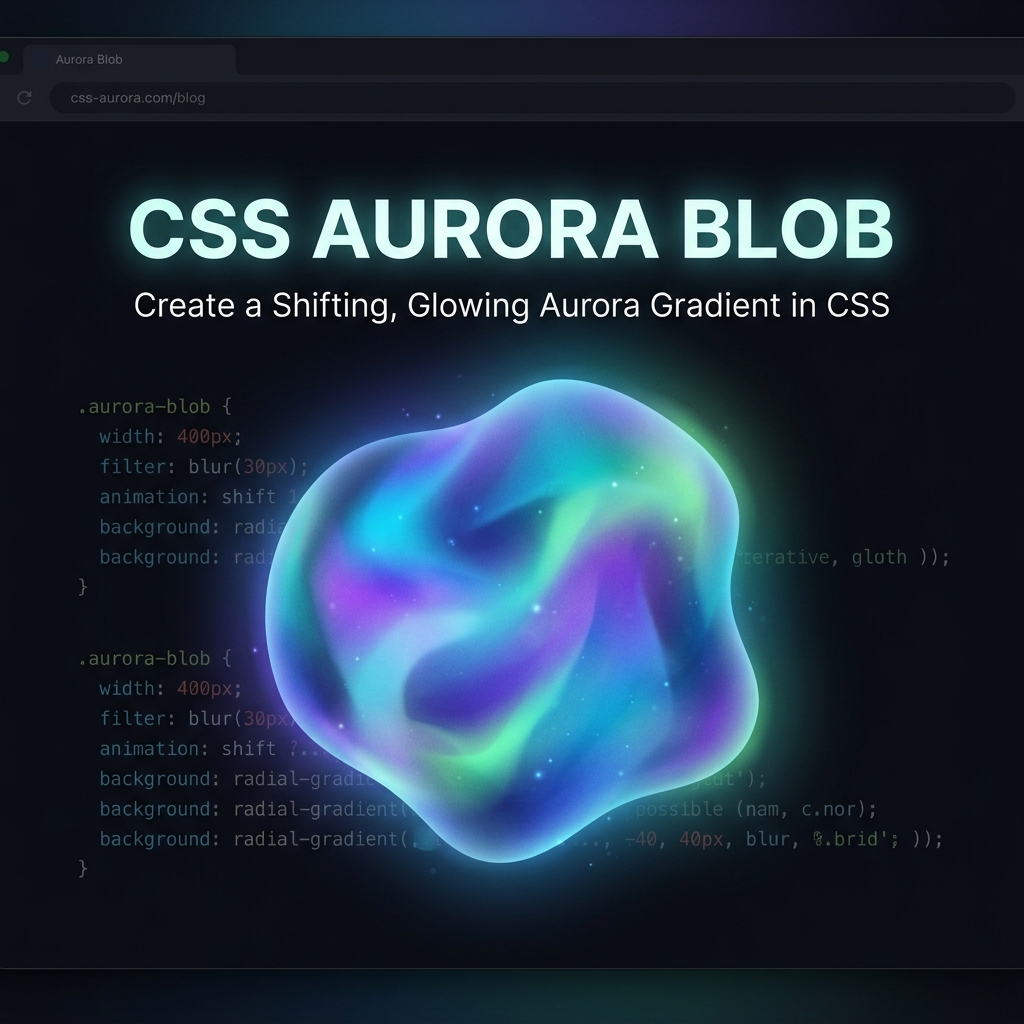
Build a Aurora Background Blob Animator (Source Code)
Create soft, animated color blobs that shift like northern lights using CSS @keyframes and filter: blur.
Table of Contents
Aurora or “mesh gradient” backgrounds are extremely popular in modern SaaS design. We can create this effect purely in CSS without massive background images!
The CSS Magic
We use absolute positioned divs with heavy filter: blur() and animate their translation and rotation to make them feel organic.
.blob {
  position: absolute;
  filter: blur(80px);
  z-index: -1;
  opacity: 0.8;
  animation: moveBlob 15s infinite alternate ease-in-out;
}

.blob1 {
  background: #ff007f;
  width: 400px;
  height: 400px;
  top: 10%;
  left: 20%;
}

.blob2 {
  background: #00f0ff;
  width: 500px;
  height: 500px;
  bottom: 10%;
  right: 10%;
  animation-delay: -5s;
}

@keyframes moveBlob {
  from { transform: translate(0, 0) scale(1); }
  to { transform: translate(150px, 100px) scale(1.2); }
}
Open the Live Demo to see the smooth, shifting northern lights effect!