Build a Fractured Glass Overlay Reveal (Source Code)
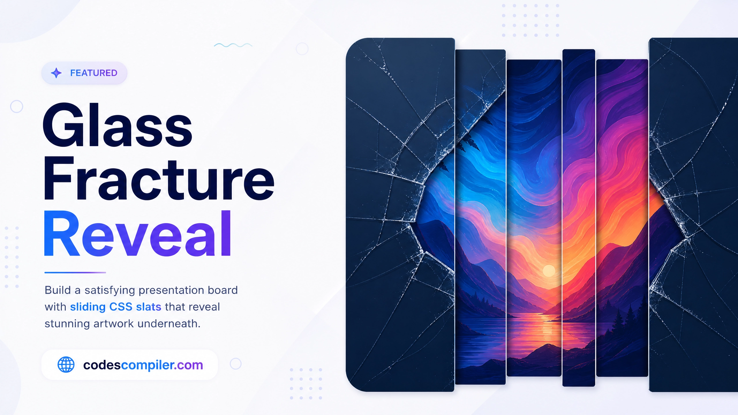
Build an incredibly satisfying presentation board where the dark cover layer fractures into individual sliding CSS slats on hover.
Table of Contents
Instead of sweeping a giant black rectangle upward to reveal an image, slice the rectangle into 4 pillars using CSS pseudo-elements, and animate them sliding off in alternating directions on hover!
The Interlocking Slats
We can use ::before and ::after on two different containers wrapped over the image. By slicing them via height and top offsets, we create a puzzle blind!
.slat {
  position: absolute;
  background: #0f172a;
  transition: transform 0.6s cubic-bezier(0.68, -0.55, 0.265, 1.55);
  height: 100%;
  width: 25%; /* 4 columns */
}

/* Map the 4 columns horizontally! */
.s1 { left: 0%; transform-origin: top; }
.s2 { left: 25%; transform-origin: bottom; }
.s3 { left: 50%; transform-origin: top; }
.s4 { left: 75%; transform-origin: bottom; }

.card:hover .s1 { transform: translateY(-100%); }
.card:hover .s2 { transform: translateY(100%); }
.card:hover .s3 { transform: translateY(-100%); }
.card:hover .s4 { transform: translateY(100%); }
Slide your cursor into the Live Demo container to watch the dark blinds physically fracture and rip apart, beautifully unveiling the art beneath.